

Project Overview
Selling supplements online is harder than it looks. The health and wellness market is saturated, buyers are skeptical by default, and trust signals that work in other niches — social proof, brand design, page speed — matter even more when someone is deciding whether to put something in their body. CRTX Nutrition had the product credibility and the science behind their nootropics. What they needed was a Shopify store that communicated that credibility instantly, guided visitors through a two-variant product decision without confusion, and converted a predominantly mobile audience without losing them to a slow load time or a clunky checkout. We built the store from scratch using a bespoke Shopify Liquid theme — no off-the-shelf template — designed entirely around the single-product, dual-variant purchase journey that defines CRTX's business model.
Key Features
- Fully bespoke Shopify Liquid theme built from scratch to match CRTX Nutrition's premium science-backed brand identity
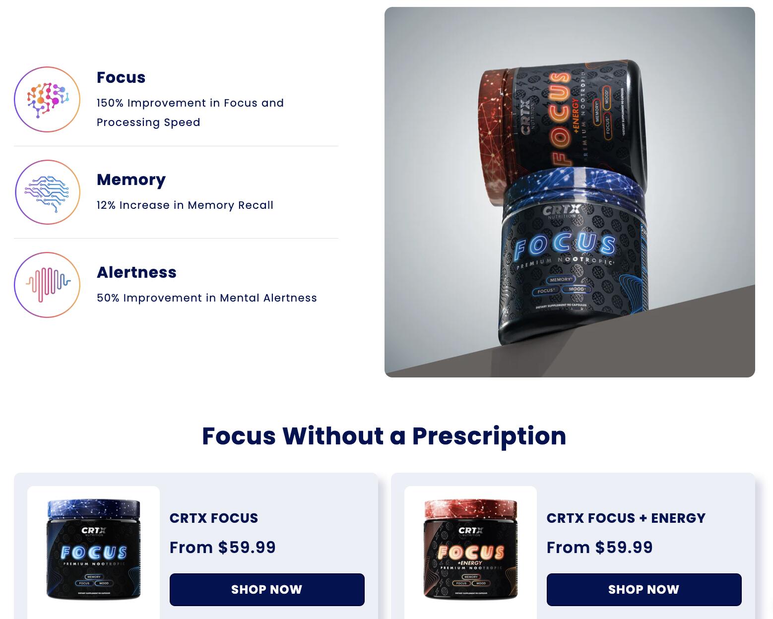
- Dual-variant product flow letting users switch between Focus Formula and Memory Formula without page reloads, dropdowns, or decision confusion
- Conversion-focused homepage designed around a single clear path to purchase — no distractions, no competing CTAs, no category browsing that takes users away from the product
- Mobile-first layout with touch-optimized interactions, clear hierarchy, and CTAs sized and placed for thumb-navigation on real devices
- Streamlined checkout with minimal steps, express payment options, and friction removed at every abandonment risk point
- Sub-2-second load times via optimized Liquid logic, WebP images, lazy loading, asset minification, and CDN delivery
- Trust architecture woven into the page design — ingredient transparency, science-backed claims, and credibility signals placed at the exact moments where supplement buyers hesitate
Technical Implementation
The store runs on a fully custom Shopify Liquid theme written from the ground up rather than customizing an existing theme — the right call for a single-product brand where every design decision should serve the purchase journey rather than accommodating a general-purpose storefront structure. The dual-variant switcher was built in JavaScript to toggle between Focus Formula and Memory Formula content — product imagery, descriptions, benefit callouts, and pricing — without triggering a page reload or forcing the user through a dropdown selection that interrupts the buying intent. Performance optimization started at the Liquid template level: render logic was audited and trimmed to reduce server-side processing time before the browser even starts loading assets. Images were converted to WebP and lazy-loaded below the fold, CSS and JavaScript were minified and deferred where not render-critical, and CDN delivery was configured to serve assets from the optimal edge location per visitor. The result was a 98+ mobile performance score and sub-2-second load times — metrics that matter specifically in a niche where competitors typically run slow, image-heavy stores that tank on Core Web Vitals. Checkout was rebuilt around the mobile majority: over 60% of CRTX traffic comes from mobile, and the checkout flow was designed with that user in mind first, not as a responsive adaptation of a desktop experience.
Challenges & Solutions
Single-product stores present a specific UX challenge that multi-product stores don't: when you only sell one thing in two variants, every visitor is evaluating the same decision — Focus or Memory — and the store has to make that decision feel easy rather than paralyzing. Generic Shopify variant selectors aren't built for this; they present variants as interchangeable options rather than distinct products with different use cases. We built a custom variant switcher that presents Focus Formula and Memory Formula as distinct experiences — separate benefit copy, separate imagery, separate social proof — while keeping the user on the same page and close to the add-to-cart button throughout. Trust was the second major design challenge. Supplement buyers have been burned by overpromised products before, and they scan for credibility signals quickly. We worked ingredient transparency, clinical references, and trust badges into the page hierarchy at the specific scroll points where skepticism typically peaks — not as footer disclaimers, but as active conversion elements in the purchase flow. Load time in the supplement niche is also a competitive advantage rather than just a technical metric: most competitors run bloated Shopify themes with unoptimized images and third-party scripts that push load times past three seconds. A sub-2-second store in the same search results is a materially better first impression.
Results & Impact
CRTX Nutrition launched with a custom Shopify store that achieves a 98+ mobile performance score and sub-2-second load times — putting it in the top percentile of Shopify stores in the health and wellness category on Core Web Vitals, which directly affects both Google search ranking and paid ad quality scores. The dual-variant product flow eliminated the decision confusion that was the primary UX problem the brand came in with — users can evaluate both formulas and switch between them without losing their place in the purchase journey. The mobile-first checkout reduced the friction that costs most supplement brands a significant portion of their mobile conversions. CRTX now has a storefront that matches the quality of their product — a premium, science-backed brand with a premium, performance-optimized online presence to back it up.